Pattern, Color, and Design Trends…the New “British Cozy”
joy of nesting
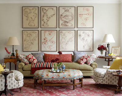
Design trends are currently moving in several different directions. One look I’m quite enamored with is a mix of fabric patterns intermingled with mismatched colors. This “homely” look brings to mind the comfort of British decorating. I’ve coined this style British Cozy.
Daniel Sachs designed this most interesting room above.
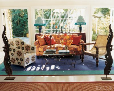
Timothy Corrigan designed the loosely styled room above. The strong, unselfconscious mix of pattern and color is where styles are moving. Keeping the scale large on furniture and accessories gives the rooms I’m featuring today their updated appeal. Even though the fabrics are retro looking the rooms look up to date because of the scale of the individual pieces.
This room above by Cathy Triant reminds me of those pastel colored macaroons that are so popular right now. Again the reason this room looks so fresh and up to date is the over sized scale of the pieces. Multi-colored schemes are tough to pull off. Choosing colors in a similar value, the same lightness or darkness, keeps the room from getting too busy.
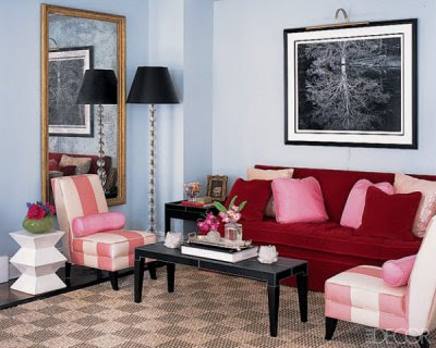
Suzanne Coleman did this simple space. Red, pink, and blue with accents of black and white. It’s the orderliness and lack of matchy matchy colors that makes it appealing.
Alex Papachristidis is one of my favorite designers right now. If only my California clients would let me do this for them! Alas, most of them are afraid of so much pattern and busyness. This room hints at Eastern Indian styles.
Rafael De Cardenas designed the room above. The colors are phenomenal. Lavender is a color requiring some confidence. It hints at royalty. Lavender is a mix of blue, red, and white and is both warm and cool.
This light filled room is by San Francisco designer Ken Fulk. It’s a masculine space with some terrific large scale pieces. I’m not sure when it was done but this space if pretty timeless.
Charlotte Moss Decorates is a book I’m recommending to friends and readers. It is published by Rizolli.


