Neutrals Needn’t be Boring: Five Top Tips on using Taupe in a Design Scheme
joy of nesting
Working on a recent design project I found a wonderful sofa and great accessories in neutral tones. The goal is to create a living room in neutrals without being boring or predictable.
The bronze lamp and zebra shade are transitional, a mix of contemporary and traditional elements. The tufted sofa is simple, elegant, and will look good for years and years to come.
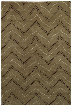
I love the quality and design of this rug. Just enough detail.
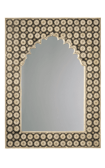
A drum pendant to go over the cocktail table and a beautiful inlaid mirror to add special touches. Still working on the remaining details.
Tips for using taupe in a design scheme:
Neutrals in their very nature are boring but designers like a challenge. You can use a variety of tricks to create visual interest using neutrals.
1. Texture is the most popular element used in creating neutral spaces. Texture adds visual interest and also much needed depth to neutral color schemes so they don’t fall “flat”.
2. A variety of neutral tones will also add visual appeal. Using taupe, ivory, cafe au lait, honey, and light chocolate brown adds further depth.
3. Scale is a wonderful element to throw into a neutral scheme such as a large Belgium hutch in the living room to house media equipment.
4. Neutral color schemes are less forgiving than their colorful counterparts and you’ll really need to edit furniture and accessories to the most essential elements. It’s not a scheme that takes kindly to over furnishing.
5. Quality will be more important in a neutral scheme because each piece stands out so clearly.


