My Interior Design Course Part II: the Principles of Design
joy of nesting
The Elements of Design
Last week we covered the elements of design space, form, line, texture, light and color while the principles of design are balance (symmetrical, asymmetrical and radial), rhythm (repetition, progression, transition and contrast), emphasis, scale/proportion and harmony (unity and variety).
The Principles of Design
This week we talk about the principles of design and how they work. If the elements are the tools or “raw ingredients” of interior
design, the principles are the recipe. Balance, rhythm and harmony in design terms explain how various visual components relate to one another and why we find them so appealing!
Balance
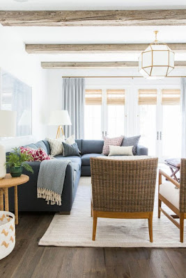
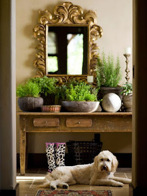
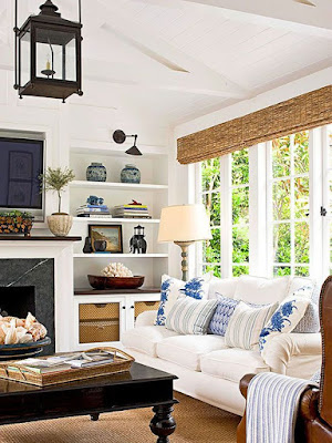
In the realm of design, balance is characterized by symmetry, asymmetry, and radial distribution. These refer to the equal distribution of weight, size or bulk of an object or space on an axis in a pleasing composition.
Symmetrical
half: a mirror image.
Asymmetrical
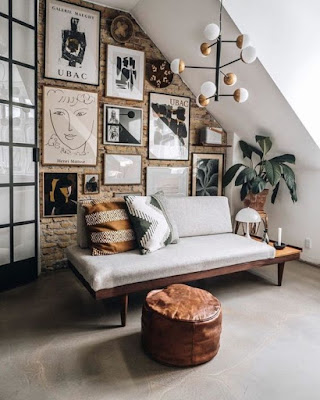
Asymmetrical balance, also referred to informal or active balance, is differing objects arranged along an axis, equal distance apart but of equal weight or bulk. And this type of balance is made up of components that differ from each other.
Radial
Radial balance is identical or differing objects placed in a circular fashion. It can be seen in modern residential spaces, museums and commercial buildings.
Rhythm
Rhythm is all about repetition, progression, transition and contrast. It is a principle that suggests movement. This often refers to the transition of patterns (as in fabric and wallpaper) and the flow of rooms in the confines of one home.
Repetition
Repetition is the simplest way to create rhythm. This is done by repeating any of the elements above as in line, color, pattern, etc., in a repetitive, consistent way.
Progression
Progression is creating rhythm through gradual yet regular changes of size or color.
Transition
Transition in rhythm “gently” leads the eye in a continuous, uninterrupted way from one area to another.
Contrast
Contrast creates rhythm by purposefully placing shapes, styles, or colors in opposition to one another. This creates excitement and visual interest.
Emphasis
Emphasis is a design principle that draws attention to a particular focal point, effectively serving as a way to ‘anchor’ a space. Color and scale are two great ways to create emphasis.
Scale
Scale refers to the proportions between two or more objects. The scale of our homes and furnishings is particularly important because it influences the overall harmony and functionality of the living space.
Harmony
Unity
Start with a Free Download
Want a home where you feel healthy, happy and connected? Then grab my design and wellness download, The Wellness Home, 5 Steps to a Beautiful, Restful Home for Women Who Value their Health and Wellness!
It’s the prettiest little book with super easy design solutions that help you lead a beautiful, healthier lifestyle at home. You’ll also get my 3-to-5 Things Framework that gives you step by step actions to get started and stay on track.
That’s it for today. Thank you for stopping by!
Shiree’
And if you’d like to dive deeper into this topic, check out my blog post, “Hiring an Interior Designer”.
