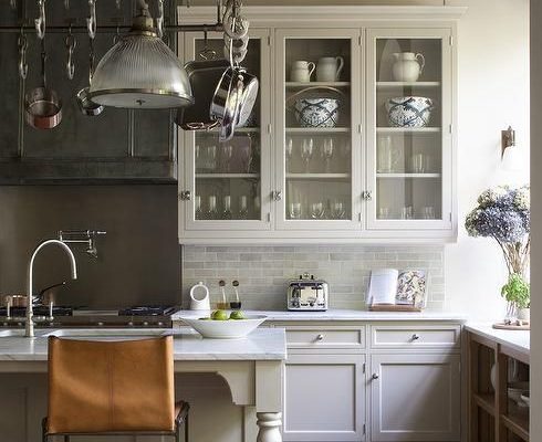
Space Planning: one of the more basic jobs of the designer
joy of nesting
Space planning may not be showy or sexy, but it’s one of the most basic jobs of the interior designer and crucial to any project. It’s all about function, pragmatism and stability, particularly in the kitchen.
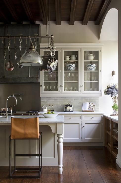
via Decor Pad
Kitchen Space Planning
The “work triangle” is at the heart of many well-designed kitchens. It’s the placement of the refrigerator, stove/oven and sink. Everything else is less important than these three elements and the distance that lies between them. I’m not saying the Kitchen Aid or cappuccino maker isn’t important. But they aren’t the foundation of the design the way the triangle is.
To put an island in the middle of the triangle, or to have one of the three workstations too close together creates a restriction in movement. A well-designed kitchen has a fluid, well edited floor plan. Beyond the triangle you need ample counter space, not too narrow, not too deep. You need several types of lighting. If you cook or entertain a lot, an additional sink can be nice.
The work triangle should be 27 feet or less, with no single leg shorter than 4 feet or longer than 9 feet. No major traffic patterns should cross through the work triangle. Work aisles should be at least 43 inches wide or 48 inches wide with more than one cook. In furniture lay outs, always keep a clear pathway between entrances and exits.
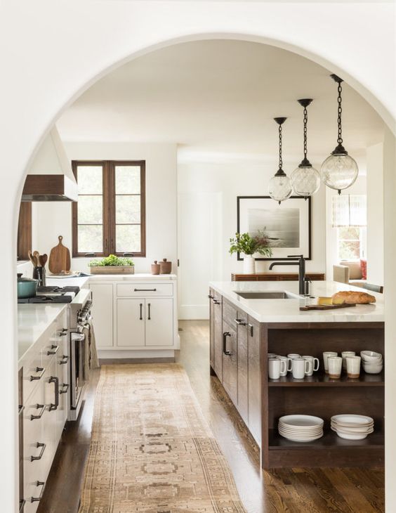
Andrea Mason
The Trouble with Islands
Islands and bars have been popular for some time. Many clients request islands in their kitchen designs but if they’re not well thought out or are too large, they can create problems.
A number of years ago I was working with an architect on plans for the construction of a large mountain home. The architect had included in his plans one of my least favorite, modern day design affectations: the Great Room.
I noticed immediately that the bar extended too far into the living/dining area leaving virtually no room for a dining room table and chairs. We caught it soon enough and were able to cut down the depth of the bar to accommodate the dining room table and chairs. In the end the bar looked skimpy. It was a trade-off. The architect made a mistake.
You can design a house on paper but to make it livable, you need a strong sense of how people will actually place the furniture. In this case, instead of an over scale curved bar dividing the kitchen from the dining area, the bar should have been omitted altogether. Before you finalize any plans check for the placement of the fireplace and built ins. Determine where the sofa and master bed will go. Check the placement of the windows, the doorways, the lighting and outlets.
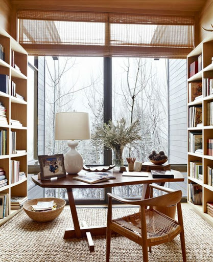
via 28 Decorating
Living Room Space Planning
In a recent project, I did two sets of floor plans for a living room. It was a spacious room with a beautiful stone fireplace and mantel, plenty of windows, vaulted ceilings, surrounded by beautiful landscaping. But laying out the furniture was a bit tricky because the fireplace was located almost at the end of a very long wall. It didn’t leave a lot of room for seating around the fire. I addressed this by drawing out plans with two separate seating areas.
For the main seating area, I proposed a 90-inch sofa, a cocktail table, console, built in bookcases, and an armchair near the fireplace, and two more armchairs and an ottoman near the television.
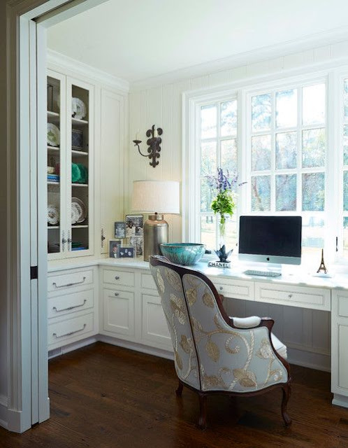
Georgiana Design
In another home, the very large living room had lots of furniture, but it was all small scale giving it a busy, unanchored look. Large rooms need at least one strong anchor such as a fireplace with flanking built in bookcases or a large hutch. By using one of these as an anchor you can further emphasize it as the main seating area with a sofa, two chairs and a cocktail table, or two loveseats. Once the main seating area is done properly, the other pieces will fall into place.
Space Planning in My Own Home
In my own living room, I’ve divided the space into two distinct seating areas. One is the main seating area with a floating sofa (meaning it’s not against a wall, but centralized in the room), two floating armchairs, and a large, enclosed hutch which is directly adjacent to the fireplace. The other two seating areas are in front of a large wall of paned windows.
I also have two additional chairs with small accent tables, one in a large picture window, and the other by the built-in bookcases. These less important seating areas have smaller chairs and tables.
Space planning is an integral part of designing and furnishing a home. If you don’t have a good floor plan, even though you might think it looks attractive, it will never function right and therefore never look right either. Once you’ve addressed the function and traffic flow of the room, and have the bones right, you can decorate it to suit your own distinctive style.
If your home isn’t supporting you the way it is, are you ready for a change? Get some help via my complimentary premier design and wellness download, The Wellness Home, 5 Steps to a Beautiful, Restful Home for Women Who Value their Health and Wellness. It’s the prettiest little book. It’s also a quick read with super easy design solutions that help you lead a beautiful, healthier lifestyle at home, plus my 3-to-5 Things Framework that gives you step by step actions to get started and stay on track. Get yourself some help, post haste!
That’s it for today. Thank you for stopping by!
Shiree’
For more on kitchens, check out my article, Three Remodeling Budgets and Check Lists for a Health-Conscious Kitchen!
