Bonny Blue Decor: High End Textiles Enhance an Architectural Relic
joy of nesting
One Saturday morning I received a phone
call from a woman who had just read an article about me in the Sacramento Bee. She said she found the article intriguing because it talked about how I enjoy working my projects around some or most of my clients’ existing furniture, particularly antiques. That initial thirty minute conversation led to a mutually satisfying, four month project.
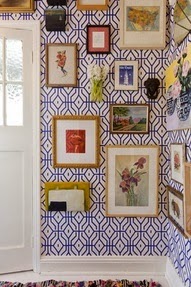
SERENA and LILY, above
Her house has the “good bones”
you often hear about when discussing quality architecture. It is a 1940’s
home built on a beautiful, tree lined street of old William Land Park. The client had all the
furniture, antiques, artwork and mementos generally collected over a
lifetime. Remodeling had taken
place in recent years. Everything was as
it should be except for one thing: the fabrics.
What she wanted was to recover all the seating in the home as well as have made new, custom window treatments to replace
the store bought curtains with which she’d been “making do”. She also wanted to do custom bedding, upholstery and window coverings for the master bedroom.
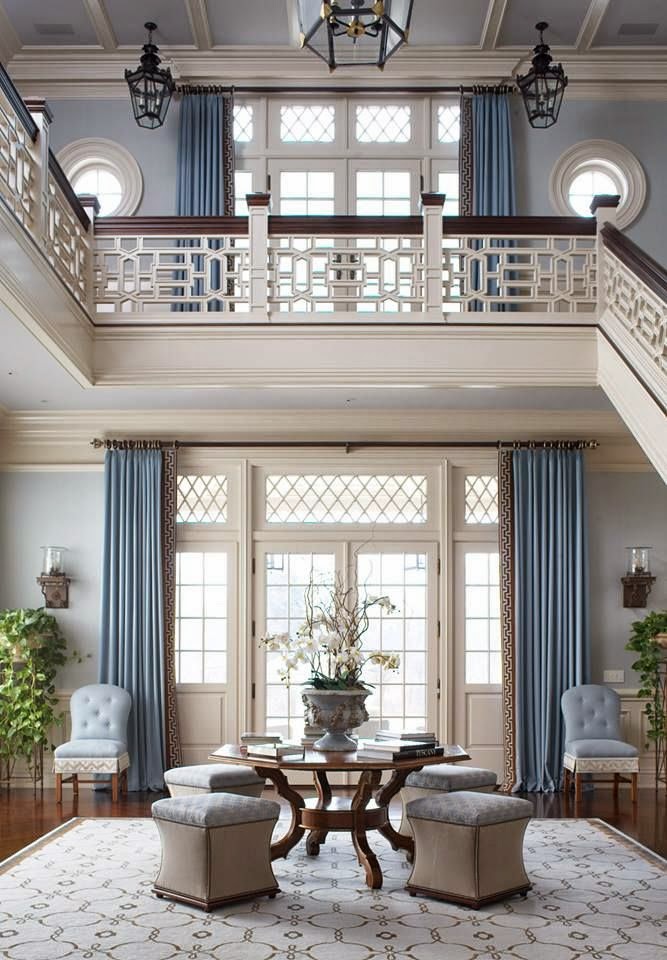
via NEW ENGLAND HOME above
Custom fabric treatments like these are a passion of mine. I usually lean towards understated designs that visually pull together the client’s architecture and furnishings. I love mixing antiques and vintage furniture with new fabrics because I find homes age and evolve well with a mix of eras.
All her furniture is of excellent
quality and merited re-upholstering. We covered the sofa in a textured
Pindler and Pindler blue linen blend and dressed it up with throw pillows in GP and J Baker’s classic, Bird of the Nile floral. We had the legs changed to gain some
needed seat height. A diminutive arm chair was covered in a sunny yellow, graphic, Robert Allen print and I designed a small, matching tufted ottoman which
the client likes to refer to as a “tuffet”. A roomy club chair and matching ottoman were
done in a Stroheim and Romann blue quilted fabric with a small yellow dot. Custom draperies were made from a crisp, tone on
tone blue stripe fabric mounted on custom painted wood traverse rods that matches the other wood work in the room and perfectly
flatters the room’s architecture.
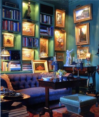
via HOUSE and GARDEN above
Though the other rooms were also done
in warm blues, they have their own distinct style. A little den off the dining
room is where the husband watches television and does light office work. We
recovered the sofa and matching chair in a textured Kravet upholstery chenille
in a warm, powdery blue. Down filled, eighteen inch throw pillows were done in a
Kravet, periwinkle blue, graphic print fabric.
via VANITY FAIR Simon Watson above
In the dining room, next to a
beautiful, Hepplewhite mahogany dining set and sideboard we hung draperies in blue
tone on tone stripe to match the living room. This provided a nice continuity
from room to room. The brass chandelier hanging over the dining room table was
an old reproduction from the client’s trip to Historic Williamsburg.
They speak fondly of carrying it home on board the plane.
The master bedroom is a light filled
room overlooking a quiet, shady street. On the windows we did floor
length stationery drapery panels in a Fabricut Collier Campbell, periwinkle blue
linen print mounted over privacy sheers. I couldn’t convince them to have room darkening window coverings of any kind. A mistake in my book but in the end, we must do what the client wants.
We recovered an adorable little arm chair that was the client’s grandmother’s in
an off white quilted, Collier Campbell fabric with striking, contrasting blue welts. We
were able to use the existing, pale yellow, quilted fabric headboard and I found a quilted
fabric for the bed skirt that coordinated with it beautifully. The duvet, pillow shams and throw pillows
were done in the same fabrics as the bed skirt and curtains.
the client’s tastes because if you take it too far from their own
comfort zones, the project invariably becomes the designer’s and not the
homeowner’s. The homeowner is much happier if their opinions are taken into
consideration. It takes more effort to work this way because you have to do a
lot of “tweaking” to get it to look right but it’s worth it in the long run
because it means the client is really happy with the end result. Ignore their input, and it will often backfire.
the direction of a design project: the architecture, the existing furniture
you’ll be working with, the location/geography, the budget, the client’s
personal aesthetic and their lifestyle. Whether I’m a fan of blue and yellow or
not (I actually appreciate all colors), it’s helpful to realize that each
homeowner has different frames of reference and unique ways of seeing color and
style.
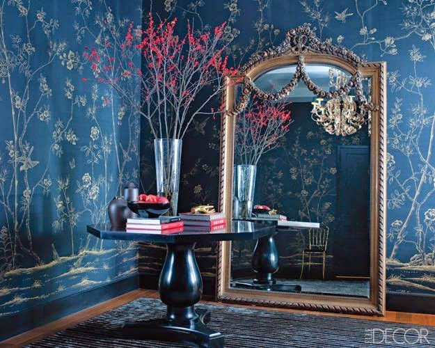
via ELLE DECOR
blue, lavender, pink or pastel yellow, offset them with masculine elements like
dark stained or rustic woods.
throughout a home is hard to “pull off”. Try alternating one color per room.
In other words, instead of blue and yellow in every room, do a room in blue and green, and
another in blue and dark red.
window covering and bedding fabrics. Make sure your upholstery fabrics are
double rub tested for longevity and your window covering fabrics are
lightweight enough to use on a traverse rod. Throw pillows and valances can usually
be done in either type fabric as long as the welts are of lightweight material.
draperies or pillows. Dry clean only!


