The Psychology of Color
joy of nesting
Color is a broad and fascinating topic…at least it is to me! It obviously fascinates others as well. There are certainly enough books written about it. I feel the need to control color in my own home. When you work with color, at the end of the day you just want to come home to something soothing. This bedroom below is anything but soothing and yet I find it interesting. It is more for a teenage girl’s room really, not an adults.
The trick to using color is in knowing color psychology. There are cool colors, warm colors, and colors that can go either way. Generally, cool colors are blues, greens, and purples while warm colors are reds, yellows, and oranges. Cool colors are restful and warm colors are exciting.
If you are trying to make a room more intimate, smaller, or mysterious warm reds, mustard’s, and terra cottas are your best bet. If a calm environment is what you are going for, cool shades of blues and greens will accomplish it.
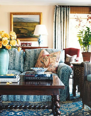
The above room is one of my favorite of Michael Smith’s designs. On my website bio I list Michael as one of my inspirations. I always mix eras in my designs. I don’t care for the static look of a home with all new furniture! This living room has a few warm touches but it’s mostly blues and browns which is very comfortable on the eye.
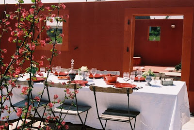
Red on a sofa or chair or any piece of furniture for that matter enlarges it. And when you paint a room red, it visually makes it smaller. This seems to be contradictory until you realize that red visually advances, or comes towards you. If its on walls, the walls advance make the room seem smaller. If it’s on a chair, the chair visually advances make it seem larger.
I am not sure if this wall color above is chartreuse or yellow but I think it’s yellow. The black and red make great color counterpoints don’t they?
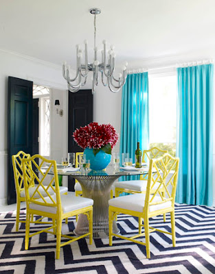
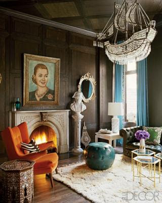
Combining the same color with a different color makes a big change in the look and mood of the space. Here is same yellow, black, and white theme but with turquoise added. See the different effect the turquoise has on the room?
The view of this Jonathan Adler room is artistic and moody. It’s a multi-color theme with touches of orange, turquoise, teal, green, and brown. Jonathan was a ceramicist initially who went into interior design. The variety of colors gives it an art school look.
Stephen Shubel has been a favorite of mine for years. The view of this bedroom appears to have a blush color on the walls. It is so soft and restful! It appears to be the color of baby skin! So sumptuous! I love the punctuation of black and white with just a touch of red, velvet no less.
Color psychology is offered through most college design curriculum’s.
Each color has two or three corresponding effects.
Psychological Effects of Color…
Pink-light hearted, healthy, feminine; playful
Purple-regal
White-clean; can be sterile
red- warm; sexy; can be vulgar
orange- warm; creative; can be tacky and cheap
blue-calming; patriotic when mixed with red and white
teal-a color of resorts and other vacation destinations
green-cool and/or warm depending on the shade; can remind you of hospitals
yellow-cheerful, friendly, can denote feelings of illness or jaundice
turquoise- exotic; multi-cultural
brown-restful; nature; boring when overused
black- crisp, classic, the color of death
