COOL, CALM, and COLLECT…The Most Delightful Bedrooms of the Decade, Says I
joy of nesting
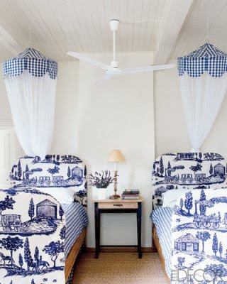
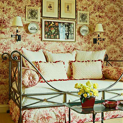
I have always felt that doing bedrooms in red is a big mistake and yet I get requests for them quite often. Bedrooms are meant to be designed with all the restful elements: calming colors, horizontal lines, and contrasts kept to a minimum. The blue toile bedroom is by interior and textile designer Kathryn Ireland.
I know there are designers who will scoff at this. I know decorating rules are meant to be broken. But if you are a designer who pays attention to the needs of your clients, you will respect their need for sleep.
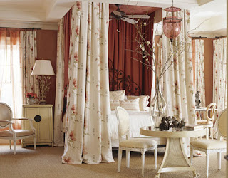
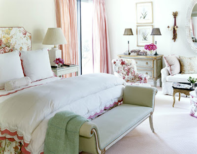
Here is a positive example of red in the bedroom by designer Alessandra Branca. This room manages to be restful with red by keeping it light and mixing in lots of cream. I call this color faded red because it’s light, yet certainly not pink.
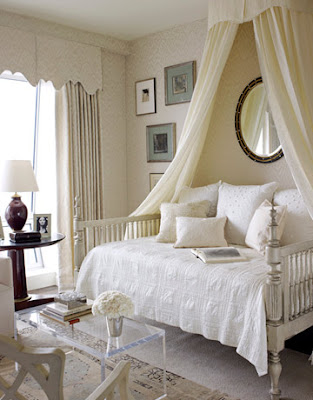
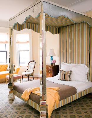
Tester beds create a protected feeling. The fabric muffles sounds from the floors above. When designing bedrooms I like to start with an idea of quiet ambiance, choosing soft fabrics in muted tones of blue, green, and taupe or light and clear ones like pale yellow and peach.
For couples I do four pillows: two for sleeping and two with custom shams for reading in bed. I do two throw pillows for decoration and that’s it. If the room is small, I’ll omit the bed skirt and opt for a nice bed frame. Unless the client has allergies, I always do high quality down comforters and pillows. The luxury of down is unbeatable in a bedroom. My guest rooms get the same royal treatment.
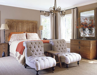
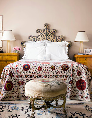
I’m sorry I can’t tell you who created the beautiful concoction above. Red in this bedroom works because it is so subtle, predominantly warm white really. It is light filled and airy and I am sure there are good, light blocking shades under those draperies.
Thread count is a blog post in itself but suffice to say high thread counts, 400 and over, are preferable. White sheets with tailored details like monograms or piping are my favorite. I love an extra thick pad atop a firm mattress. Having tried the down mattress pads unsuccessfully (feathers poke through) I stick to high quality synthetic down.
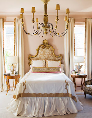
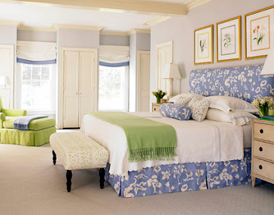
Albert Hadley designed the bedroom above. Pale colors, soft textures, soft focus design: this is a look that is hard to pull off so successfully. Mr. Hadley has been a decorator for decades. He worked with the famed Sister Parish on the East Coast eventually becoming her partner and forming
Parish-Hadley. I read her biography years ago and it was just wonderful. I loved that Albert called her Sis. My feisty grandmother was called Sis by all who knew her.
