Interior Design Course Basics: Part 1 the Elements of Design
joy of nesting
Welcome to part 1 of my interior design course. Today we’ll learn the basics, the elements of design.
The Language of Interior Design
Interior design, architecture and art are visual fields and the language we use to describe them is fairly subjective. ‘Warm’, ‘bright’ and ‘cozy’ can mean different things to different people.
In my Interior Design Course Basics Part I Elements Design you’ll learn a language you can use to accurately describe a space and also, understand why you find it so appealing.
Why Are Some Spaces so Appealing
There is terminology used in the professions of architecture and design. And there are explanations as to why a space appeals to you. It’s not only a matter of personal taste or the styles you’ve been exposed to, though that has a lot to do with it too.
It’s also because when a space employs the basics principles and elements of design, we as individuals are naturally attracted to them somewhat like the attraction we feel towards water and fire.
My Interior Design Course: Part 1 the Elements of Design
According to college design textbook “Inside Today’s Home” by LuAnn Nissen, the elements of design are space, form, line, texture, light and color while the principles of design are balance (symmetrical, asymmetrical and radial), rhythm (repetition, progression, transition and contrast), emphasis, scale/proportion and harmony (unity and variety).
In my Interior Design Course Basics Part 1, the Elements Design we’ll go over a vocabulary for various elements of design, as well as an explanation as to how and why the elements work together.
The Design Element of Space
An interior space is created simply by putting walls together to form an enclosure but there are appealing and unappealing enclosures. An architect or designer controls and improves a space by using certain design elements to achieve a sense of spaciousness, or the opposite of spaciousness: intimacy.
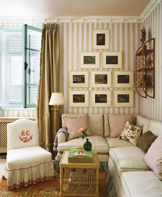
There are many ways to increase the feeling of spaciousness such as keeping furniture and accessories to a minimum; using strategically scaled furniture and textile patterns; selecting colors that are cool and light with little or no contrast; placing furniture close to and paralleling walls; use of windows; and using mirrors to create reflected space.
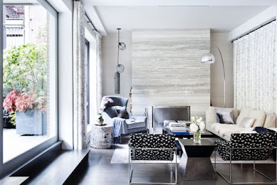
To create feelings of intimacy or “coziness”, you can subdivide the space by placing furnishings perpendicular to the walls to form “room dividers”; use warm, dark colors; and choose varying heights of furniture to obstruct the views around the room.
Form and Shape
Forms and shapes fall into three basic categories: rectilinear, angled or curved lines that become the geometric shapes of the square,
triangle, circle, or in solid form, the cube, pyramid, sphere, cone and cylinder. In design, these shapes serve as the basis for buildings as well as the products that go in them. Not every shape can be identified as one of these shapes obviously, but every shape contains at least one of these basic elements.
triangle, circle, or in solid form, the cube, pyramid, sphere, cone and cylinder. In design, these shapes serve as the basis for buildings as well as the products that go in them. Not every shape can be identified as one of these shapes obviously, but every shape contains at least one of these basic elements.
The Use of Line in Interior Design
In interior design terms, line usually describes the outline of a shape or space but it also attributes to our perceptions of masculinity, femininity, playfulness, or austerity depending on the line’s direction, angularity or amount of curve.
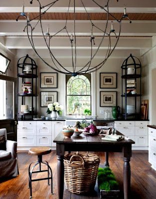
Vertical and Horizontal Lines
Vertical lines evoke feelings of formality and aspirations. Horizontal lines are restful and informal and are often used in contemporary designs; diagonal lines are active and dynamic and suggest upward or downward movement; small-curved lines
are playful; and wide, horizontal curves suggest gentle, relaxed movement.
Line is seen in the lofty height of a vaulted entrance, or the low and restful, horizontal surface of a bed.
Texture
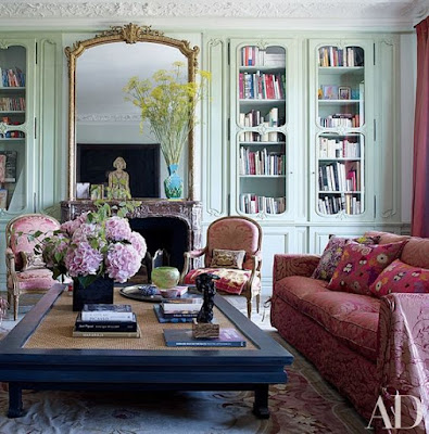
Smooth or rough, texture describes the tactile feel or appearance of the surface of an object like stone, mohair or chenille fabrics, or a woven basket.
Texture can be ornamental; it can absorb or amplify sound; and is a factor in the maintenance of an object. The shiny surface of a glass table is easier to clean but shows every little smudge. The rough surface of a stone hearth shows little dirt but is harder to clean.
Light
Light is important to our physical and psychological responses. It affects our mood and can change the appearance of our surroundings. The style of your home’s architecture will play a part in the amount of indoor light you have.
Spanish Revival style is known for romantic, nuanced light play. Modern architecture with its wide expanses of glass brings the outdoors inside. Each has a prominent place in design, but aging is a factor in all of us. If you are planning your forever home, plan one with plenty of natural light.
The amount of natural light a home has is subject to design trends. Today’s homeowner seems to prefer a light filled home. Skylights and solar tubes have been a boon to many dark and dreary interiors.
A Course in Basic Color
Color is a powerful design element. The various theories about color are based on art, science and psychology. To accurately describe a color you would refer to the terms hue, the actual name of the color; value, the lightness or darkness of a color; and intensity, how pure versus how muted or grayed the color is.
There are primary hues, secondary hues and tertiary hues. Primary hues are colors that can’t be mixed. They are primary red, yellow and blue.
Secondary hues are mixtures of primary colors: orange, green, and violet. Tertiary hues are mixtures of secondary hues.
Combinations of harmonious colors include monochromatic schemes, which are based on various values and intensities of one hue. Additionally, analogous schemes utilize two or more hues that are next to one another on the color wheel. In contrast, complementary schemes are based on colors directly opposite one another on the color wheel.
Reactions to Color
Reaction to color is highly subjective. Each comes with its own personality and/or stigma attached. For instance, yellow can be sunny for some of us, or signify cowardice for others. Pink is a pretty, feminine color that some love and other’s find cloying. Black can be classy or morose. White can be pristine and bright or overly sterile. Red can be vibrant and classic, or it can be cheap and gauche.
The affect depends on the context in which the color is used, what it’s placed next to, and the individual’s emotion towards it. And sometimes it’s based on effective branding, such as the green of a Starbuck’s logo or the orange packaging of luxury brand Hermes’.
I hope you’ve enjoyed part 1 of my Interior Design Course Basics, the Elements Design.
Next time we’ll go over the principals of design. Stay tuned!
Download The Wellness Home
To get started on a home where you feel healthy, happy and connected grab my complimentary design and wellness download, The Wellness Home, 5 Steps to a Beautiful, Restful Home for Women Who Value their Health and Wellness!
It’s the prettiest little book. It’s a quick read with super easy design solutions that help you lead a beautiful, healthier lifestyle at home, plus my 3-to-5 Things Framework that gives you step by step actions to get started and stay on track.
That’s it for today. Thank you for stopping by!
Shiree’
And if you’d like to dive deeper into this topic, check out my blog post, “Hiring an Interior Designer”.
