5 Design Principles that Make Your Home More Restful
joy of nesting
A well-designed home creates a healthy, balanced lifestyle. It supports things like eating right; exercising; getting plenty of downtime; sleeping better; and being more mindful of the life you get to lead. My 5 design principles that make your home more restful will help you make the right decisions when you’re ready to do some upgrades around the house.

What is Meant by Design Principles
According to college design textbook “Inside Today’s Home” by LuAnn Nissen, the elements of design are space, form, line, texture, light and color while the principles of design are balance (symmetrical, asymmetrical and radial), rhythm (repetition, progression, transition and contrast), emphasis, scale/proportion and harmony (unity and variety).
Interior design, architecture and art are visual fields and the language we use to describe them is often subjective. This terminology provides designers with a common vocabulary for general aspects of design, as well as an explanation as to how and why the elements work, i.e. look and feel so good to your senses.
Enjoy this special edition of Joy of Nesting and thank you for being a valued reader.
The Design Element of Light
Light is important to your physical and psychological wellbeing. It affects your mood, immune system, changes the appearance of your surroundings and informs your body when it’s time to wake up or go to sleep.
There’s natural light, ambient light (also called general lighting), task lighting and accent lighting. Natural lighting brings light into your home via window space and open curtains and is a great way to improve emotional wellness.
New LED lighting, also known as circadian lighting, is available with smart home systems and mimics the sun’s natural affects throughout the day in order to assist your sleep patterns. They are customized to fit each person’s individual needs.
Choosing Restful Colors for Wellness
Color is a powerful design tool and one of the easiest ways to engender feelings or emotions in your home. But reaction to color is highly subjective and each color comes with its own attributes and/or stigmas attached.
For instance, yellow can feel sunny and cheerful for some people and signify cowardice for others. Pink is a pretty, feminine color that some love and other’s find cloying.
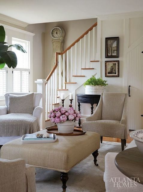
When you create spaces with health and well-being in mind, choose cooling, restful colors like cool blues; soft lavenders; pale blue- greens; the palest blushes; and crisp, clean neutrals. Cool colors recede, meaning, like a hairline they “go back” so when your walls are painted in light, cool colors it visually increases the size of the room. It adds depth at the end of a room, hallway or garden path.
To give your home a healthy feeling and visually enlarge your spaces, use light, cool colors with minimal color changes and minimal darkness to lightness contrasts meaning keep everything fairly light, even if the colors are different.
Soothing Textures
Texture describes the tactile feel or appearance of the surface of an object like stone, mohair or chenille fabrics, or a woven basket.
For purposes of health and wellness, textures as they pertain to fabrics and other furnishings around the home should be soft and comforting such as beautiful baskets and rugs.
Texture can absorb or amplify sound. It affects the maintenance of an object. The shiny surface of a glass table is easier to clean but shows every little smudge. The rough surface of a stone hearth shows little dirt but is harder to clean. In some places in the home, smooth textures are preferable in order to keep surfaces clean such as countertops and cabinetry.
The Design Principle of Balance
Balance (symmetrical, asymmetrical and radial) refers to the equal distribution of weight, size or bulk of an object or space on an axis in an aesthetically pleasing composition.
Symmetrical balance, also known as formal or passive balance, happens when one side of something is the exact same as the other half: a mirror image. This type of balance can be seen in a pair of sconces flanking a painting above a fireplace; two candlesticks flanking a centerpiece on a dining room table; or two exterior lights flanking a front door.
Asymmetrical balance, also referred to as informal or active balance, is differing objects arranged along an axis, equal distance apart but of equal weight or bulk. It’s used in casual design and is generally more complex than symmetrical balance. Rather than having identical objects on an axis, this type of balance relies on mismatched items with equal scale or perceived weight. Asymmetrical balance can be seen in arrangements of framed prints or photography on a wall, and in the floor plans of a ranch style residence.
Radial balance is identical or differing objects placed in a circular fashion. It’s often used in modern residential spaces, museums and commercial buildings. You can see radial balance in action with chairs around a table in the middle of a room; a crystal chandelier; or the structure of a circular rotunda. It directs your attention to the center of the space or object. It is the least used type of balance.
If done right, a space with any of these types of balance will calm you while spaces without balance can make you feel unexplainably uncomfortable. All are appropriate for interiors design with health and wellness in mind.
Bringing Nature Indoors
I love including plants in my design projects and in my own home. A home without plants or flowers doesn’t look finished or feel inviting. Bringing nature indoors is a great way to enhance your mood and help get you through winter.
My favorite adage is that “if your home is missing something it’s likely greenery, texture or scale”.
I have several go-to looks for decorating with greenery. I love to do topiary in a great jardinière or ceramic pot. Or an etagere of ferns.
Designing with Plants
Topiary in pairs, particularly on the dining room table in pots that coordinate with the room are another favorite. My favorite dining room table arrangement is a central tray of alcohol bottles flanked by two modestly sized topiary.
Tall, multiple tiered stands filled with one to two types of plants or flowers. Maidenhair ferns and violets make a great vertical display. Going vertical is a great solution when space is limited. This is equally beautiful indoors or on outside patios. I have maidenhair ferns in my dining room that gets lots of sun and is easy to water.
That’s it for today! I hope you enjoyed this week’s article on wellness interior design as much as I enjoy sharing it with you. For a bit more on wellness interior design, then check out the Wellness Home Cheat Sheet I created for you.
It will give you ALL the deets on wellness design. The Wellness Home Check List will help you instill wellness elements into your next design project. Here’s a link to the Wellness Home Cheat Sheet again.
Bye for now!
Shiree
If you’d like more on principles of design, check out Creating Healthier Eating and Better Connection.

